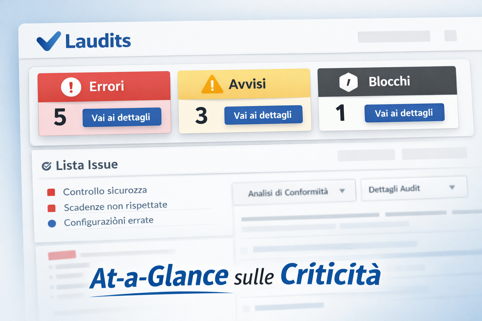
The new At-a-Glance header displays errors and warnings at the top. One click takes you to useful details. Less scrolling, more action.
Laudits changes pace: issues are visible right away with the new “At-a-Glance” header
We simplified how audits are read: issues up front, quick actions, details only when needed.
In audit and compliance, clarity means time saved. Until yesterday, finding errors took patience. You had to scroll long reports and check many lines one by one. The method worked, but it was slow. Today we introduce Laudits’ new At-a-Glance section. The most important information is now at the top.

The goal is to reduce on-screen noise and guide action. Instead of looking for scattered signals in the report, open items are grouped and readable at the top. Open the report and you immediately understand the status.
Less scrolling, more action
Time spent searching for an error is time lost fixing it. With the new header, the report “speaks” at first glance. The rule is simple: if there’s a problem, it must be obvious. Laudits becomes more action-focused and less “for reading.”
“Key messages are visible right away. Project status is clear without touching the mouse wheel.”
This choice brings three concrete benefits in day-to-day work:
- Instant view: errors, warnings, and blocks are gathered at the top.
- Fast decisions: in a few seconds you know what to do and how urgent it is.
- Less manual checking: no more “hunting” for red flags in the report.
Summary should not remove context. Sometimes knowing “there’s an error” is not enough. You need to understand what causes it and where to act. That’s why details stay available, but no longer take over the view.
- See: read the header and spot issues right away.
- Go straight there: use the new “Link Button” to open the right section.
- Fix: work on the data with full context and clear steps.
Details remain available, but they no longer cover the big picture.
We added more direct navigation to the details. The header flags the anomaly with a clear message. If you need more clarity, one click on the linked button is enough. You land right on the section with the useful data.
The button sits inside the alert and points to the correct part of the report. The page automatically scrolls to the right section. You find raw data, context, and the fields that caused the issue. You get a clean view on top, plus a full report below.
Think of a morning with ten audits to review. Before, you opened each report and scrolled to the end. The goal was only to see if everything was “green.” Now At-a-Glance gives an immediate outcome: ok or attention. If everything is fine, close it and move to the next. If there’s a problem, click and go straight to it.
The layout also works well on mobile, where space is limited. Top messages reduce zooming and scrolling on touch screens. The page adapts to the device and stays readable. You can check audits even while you’re away from the office.
Practical result: less time spent finding issues, more time solving them. Reading becomes more linear. Urgent items stand out right away, without unnecessary steps. This reduces distraction errors and verification delays.
The new header is already active for all users. Open a report and try the At-a-Glance section. You’ll see how fast it is to go from message to fix. We will keep improving readability, links, and priority signals.